Building an Open-Access Database for Ocean-Everything
Project and client: Ocean Archive, TBA21, Austria
Timeline: 2019 — 2020, initial UX Research took 6 weeks
My role: UX Researcher and UX/UI Designer at Lucid.Berlin
Open-access digital platform that seamlessly integrates art, science, policy, and conservation, inspiring care and action towards the ocean.
Insights from 50+ interviews and regular co-creation workshops shaped design and functionality.
Project scope
The scope of this project was to create the biggest ocean-related online depository with emphasis on both serendipitous and context-related user experience. The platform would bring together art, science, policy, and conservation and enable users to explore a wealth of ocean knowledge and share their own experiences and stories.
Goal: Create seamless user experience and integrating diverse content from art, science, policy, and conservation to facilitate exploration and sharing.
Research focus
Creating a seamless user experience for a platform with vast content diversity without extensive onboarding.
Ensuring content creators have ample opportunities to add context to their entries.
Managing a large volume of diverse content and facilitating multidisciplinarity.
Ensuring equal usability across different user expertise levels without oversimplification or academic overload.
Developing a sorting tool for personalized user experiences within the archive.
Research setup
Data Analysis
Conducted comprehensive stakeholder analysis and analyzed content for potential onboarding challenges.
Co-Creation
Held regular co-creation meetings and workshops with experts and professionals, from art, science and academia.
UX Testing
Conducted A/B testing of essential elements and iterated based on feedback. Explored diverse user journeys from exploration to serendipity concept.
Insights and Development
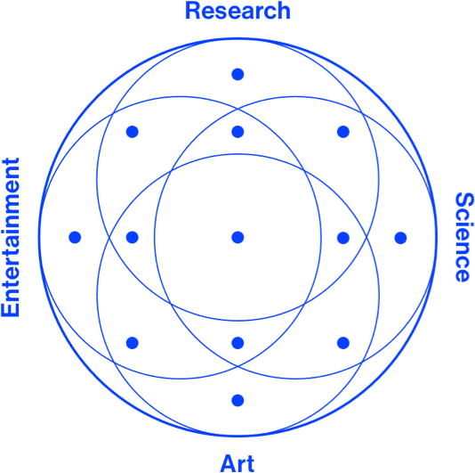
One of the key insights was the need to embrace multidisciplinarity, where users with different levels of knowledge and expertise can navigate the platform with ease. To address this, the research team developed a focus-based system that aggregates content from various backgrounds and enables users to set up their preferences for a personalized search path.
We were able to provide a personalized user experience that combined and aggregated content from various backgrounds. This resulted in a seamless user experience on a platform with potentially millions of entries of different contents that did not require comprehensive onboarding for the user.
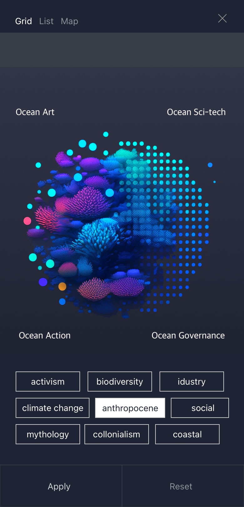
Internally we called this feature “Bubble”, besides the regular search option we created unique system, that allows the user to select position of their interest within the “bubble” feature on both desktop and mobile version. Additionally, user can add additional tags of interest, which results in sorting mechanism and suggestions, rather than filtering.
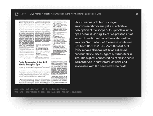
This feature also enabled various content creators, scientists, artists, and institutions to have nearly limitless possibilities to add context to their entries in the back end without limitations or creating new tags. We tackled challenges such as dealing with a huge amount of diverse content, taxonomy, multidisciplinarity, and providing a user-friendly experience concept for a wide range of audiences, from experts to enthusiasts in ocean-related topics.
Research and Design impact
Multidisciplinarity
Comprehensive research and co-creation with different experts helped us bring the best experience for a diverse group of users and their interests.
Taxonomy
Dynamic tagging system for creators that allows full flexibility to provide the right context to their content, enabling uploads of over 2+ photos, videos, texts, and audios.
Sorting system
Creating an interactive sorting system that functions as an onboarding tool for newcomers to the website, resulting in a 60% reduction in user dropdown.
Disclaimer
All images and materials in this case study belong to Ocean Archive, managed by TBA21. My role as an employee of the contractor of Ocean Archive was to showcase my skills, and no sensitive data or confidential information was used. The information and visuals provided were created for presentation purposes only, using placeholder data and photos generated by Midjourney AI and initial concept art that was not implemented in final product. This case study does not reflect the views or opinions of Ocean Archive or TBA21.


